Children's book cover Part 2
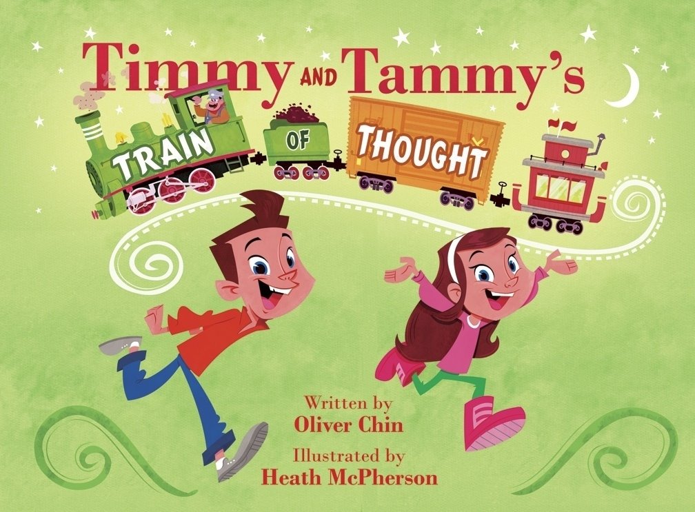
 Above is the latest work-in-prog of the cover. I've already made some changes with help from other artists comments. Thanks guys!!
Older idea
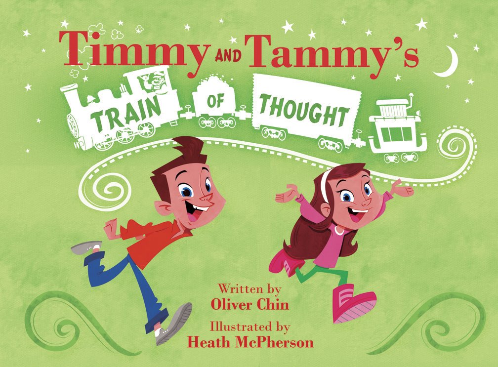
Right now I'm not too happy with the work I've done on these two cover comps. So I wanted to post these up if anybody out there wanted to give some honest feedback on how to make this idea better. Any suggestions? I enjoy good hard critiques so I'm very open to hear any feedback about what I can change. Hey! give me a better idea for this and I'll let you name our firstborn....uh, well, maybe I won't go that far.
The more I think about it, I hope we (as artists) can start using blogger for critiquing and less for ego boosting. It's sometimes painful for folks you don't really know to rip on your little masterpiece, but learning what you're doing wrong is a great way to improve your skills. So lemme have it! No pats on the back!!
This book is a product of Immedium. Written by master storyteller, Oliver Chin.
posted by Heath at 9:02 PM
![]()
![]()


21 Comments:
the only thing I can say is that I prefer the silhouette of the train on the first one more than the second. The silhouette lets the eye be drawn to the kids, whereas the color train takes away from them i think. Other than that..seriously..its awesome. I cant find anything wrong with this...and im not "boosting your ego"!
These look great Heath,
I think the white train works the best fot the title.
From an Art Director’s point of view, I would like to see the “Train of Thought” bigger and “Timmy and Tammy’s” a little smaller. Then I would like to see the girl and boy closer together. You are getting some trapped space between the header, boy, girl, and credits.
I think the title and the children are fighting each other in there size and emphasis.
Maybe something to offset the symmetry some would creat interest. Maybe an addition of ground below the children’s feet would tie them together some.
Hope that’s clear.
Really enjoy your work, great stuff!
I don't really mind the colored train, but I do agree with Ben when he says that not enough focus is put on the kids. I think maybe they can be made bigger, so you would also get a more variety of size. I also don't really like how symmetrical it is. I would probably put both of the kids together in a group and move them off to the left, and put the type next to them. And I bet a cooler, darker color in the background would help put more contrast on the kids, and would probably work well with that beautiful warm glow you have behind your train in the second piece.
That's my two cents. Hope it helps.
Dani
Actually,
I rather prefer the rain just as a silhouette, though I also agree with what people above about "more" emphasis for the kids( as larger - there´s still some space for them be like so )since seems like they´re the protagonists, afterall...
Ok, so i really like the color train, however seems like the other comments before me prefer the silouetted one. Maybe explore the silouette more, maybe the white bothers me, try another color maybe?Orange(with that yellowish color behind it)? Green(the same color of the swirls at the bottom) The kids could be closer, but i think they are fine to me, it makes use of the cover space better. Timmy and Tammy title should be the bigger, trains of thought should not be the main thing. Maybe Train of Thought can be on an S curve like it is but NO TRAIN...maybe put the silouetted or colored train above Timmy and Tammy title(smaller of course)
Those are my suggestions, it looks so fun man!!! This book will be great
Hey Heath, how you been?
Since you asked for crits... I totally agree with Kirk up top that the titles and kids are competing for space. My thoughts though are to make "Timmy and Tammy's" bigger, shrink down the trains just slightly (I like the color trains ALOT more), and then you can increase the size on the kids if you feel that is necessary... (I shoulda said this all depends on what the focus is, if Train of Thought is the main focus, then I think it can be way bigger and you can downplay the Timmy and Tammy, just like Kirk said)
I was looking at the intense colors on the train, I like that, I think desaturating them would take something away, but maybe make those green swirls at the bottom more intese, pump up the color like the locomotive, that way the eye will not be drawn to only the train area...
Sorry, I just lost my train of thought on this (I totally did not intend the pun) I prefer just trying stuff in Photoshop, testing it all out until stuff works... Good luck...
Oh, and this piece looks great... pat, pat, pat... :)
Heath,
I agree that the color trains is a bit overpowering, and I prefer the silhouetted version.
There's something about the kids, too though. I think it's your depth cues that are off, which is flattenning everything out.
I see the kids overlapping the track, but they don't at any point overlap the train, so it looks like the train is over their heads, not behind them.
Also, the fact that both kids' arms are going one direction is flattening things, maybe one could be in a more traditional running pose, with an arm forward.
The girl's pants are missing contour lines as well, and I can't exactly tell which leg is closer, so that's flattening things as well. You could fix it by giving opposing contour lines along the legs, or at least a line defining which leg is which, along the crotch seams, as with the boy.
A more time consuming fix would be to give some clear indication of the shape of the foot, defining inner and outer edge forms. This actually goes for the boy as well, because even with his crossover line, at small sizes it gets confusing which leg is which.
And I like the previous suggestion of adding a ground plane for the kids to pull them forward more.
But if you're interested in layout fixes for th train, why not have the kids actually running atop the train. "Timmy & Tammy's" floats atop as-is, train of thought can still be plastered on the train, the train can remain colorful, ad the kids can still be more of a focal point.
Just my two cents. Keep it up, bro. And I agree that we need more honest critiques around the blogosphere. Feel free to return the favor people!
~R
Wow! Thanks everybody for taking the time out to give me suggestions on how to make work a little better!
Ben, Kirk, Dani, Marcos I agree with you. The silhouette version is much clearer. But the book is also about the different trains they ride on. Actually on some pages Timmy and Tammy are not even seen. That...and my client really wants the colored train version. :)
Dik, Thanks for the feed back! ACME guys know the drill! I wish that we could have talked more at the con. Take care ma man!
Randy, Wow! Really good review!! Thanks for your wisdom! I went back and added more line work on your behalf. I needed to hear that!!
Just a comp is due soon, so I will revisit other commits that Kirk, Jeremy, and Randy suggested in photoshop later on before committing to the final. Thanks again guys!
Very nice! Great Job!
Ya, with the book about trains, I would agree.
Hey, a quick thing on the boy's front shoe. I'm reading the legs as though the forward leg is his right, but the detailing on the bottom of his shoe is reading like the arch is pointing the other way. In other words, it seems like his left foot is attached to his right leg.
Maybe I'm reading it wrong, but that's what I see.
I like the reworking, though. The overalls are much more train-friendly for the boy, and the blue color for the girl's pants is much clearer.
Not sure the leg lines are clear enough for my taste, but it technically solves the problem I guess. I just had to look really close to see them. Maybe 2-3 line-width pinstripes to define the direction of the legs more? I'm getting some weird shifting when I look at the left leg in relation to the foot. Maybe the girl's front foot should be pointing down more? Seems to be throwing me off the way it is.
Glad you thought well of some of my suggestions, though. Keep up the good work.
~R
When I said pinstripes, I meant horizontal stripes, to describe form, not vertical decorations. Maybe shading would be helpful in their absence. The legs themselves seem to be flat, while the boots have shading in several places.
And Heath, always feel free to come over to my blog (hint, hint) and return the "favor" of all my criticisms. You know, "wounds from a friend can be trusted" and all that...
~R
Heath, the top image, the newer one, looks to me to have the more 'classic' children's book/lp look to it. The silhouette for the train was fine, but didn't bring the concept home. The top one works perfect because the title is, of course, a TRAIN! Makes more sense to have a train featured. You did a great job in cutting back in some of the train details, while at the same time putting in some much needed color. And the font used for 'Timmy and Tammy's' is perfect. Gives a great childlike fun quality to it.
This is fantastic, Heath! Tell me all your secrets!
Heydy hey.
The covers are gorgeous, and everybody's crits are great. I think I like the ideas about moving the kids closer to each other and putting them off to one side. And of making Timmy and Tammy's smaller, with Train of Thought big.
It's all very flat, but that's super cool, because it's your style. Lots of 50's UPA influence, I guess. But all this got me wondering what I would have done, with my tendency to try to use a little more depth and dimension. I did a quick sketch, and put it up on my blog -
http://garrisonsjunk.blogspot.com
I like this idea, because you get the fun of the kids in the train, and you can see it coming out of the tunnel. But when you put the train on an angle like this, it's hard to draw one of my favorite things about your trains - the way they're always bouncing up in the air. Maybe some shadows and hard work could make it clear, I don't know.
Also, since I've got the kids waving, maybe you could get some non-descript, happy people watching the train pass, off to the sides.
Hey, Heath. I'm glad you like it so much, but if you're really thinking about going with it -- Just remember to try and keep it simple. To me, the beauty of the covers you've done comes from their perfect simplicity.
That's why I think, if you add folks around the train, maybe they could just sort of be purple blobs. Except that you can see them smiling and waving. Or maybe you could nix the crowds, and just have the kids pumping their fists and having a good time, instead of waving.
I should have drawn a little steam shooting out from around the wheels. I thought about putting the engineer in there with the kids, but I wanted to keep it simple. I wonder, though, if the publishers will want to avoid showing unsupervised children operating heavy machinery. If so, the engineer could just be in there, standing back and letting them have their fun.
Later!
G
Hey. Just wanted to let you know that I enjoyed looking through your blog. Your stuff looks really nice.
Yeah, I see the fun in C_G's sketch, but to me the idea is a bit more cliched than the existing illos, Heath. Just throwing my two cents in.
I'm sure whichever way you go it'll be cool looking, just seems to me the "kid engineer" thing has been done before.
I need to shut up, now, or you might start thinking I don't like your work. Which is of course, preposterous!
Peace-out!
~R
Oh, and I liked the poem over on the GoF site as well. Good stuff.
i prefer the colored train, but i think it's fighting with the title on the top. (either change the font or the color)
the bottom cover reminds me of christmas.
background color is fine, the character really stand out.
maybe you can try putting some borders; looks like they are flying everywhere.
over it's a cute design, good luck!
Looks Great Heath - I see that the changes are a huge improvement from the first one. Lovely Kid characters. Love the whimsy!
This is so cool Heath. Thanks for giving us a glimpse at your method!
howdy cousin in law! it's awesome that you are illustrating books dude, much props on that hope ill get to see you and tiffany for chanukkah, i love the dreidel. anyhow, oh this is nick.
peace.
NiX nAMe
ps.i'm used to using millions of html tags, so only having 3 hurts me.... nixnamefff@yahoo.com
Beautiful stuff, Heath. Love your style!
Post a Comment
<< Home